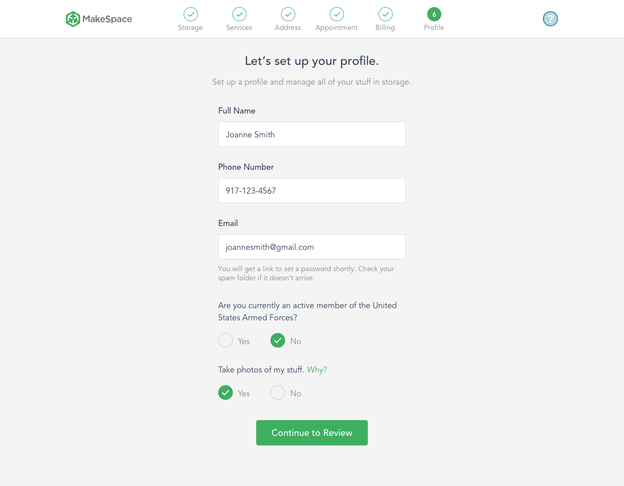
Mobile Web UI Library
A non-optimized mobile web experience lead to a lengthy process for customers trying to sign up on mobile. By creating a UI library it allowed us to design for the platform by creating a more concise experience.
You can read more about this process on Medium.
How The Flow Was Improved
Condensing the forms helped the user get through the flow faster and reduced the bounce rate.


Original design on the left and the modified design on the right.
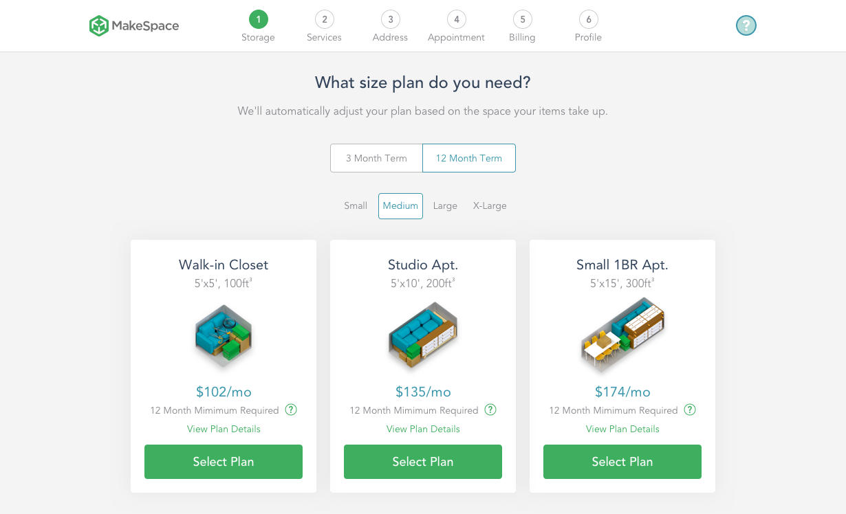
Web Booking Flow Optimizations
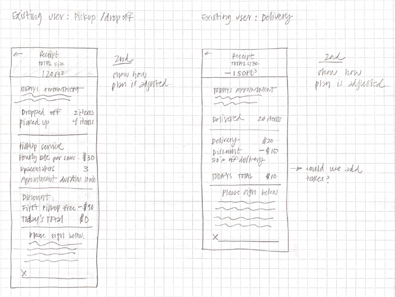
Optimizations to the web booking flow included introducing new plan lengths (3 and 12 month plans) and pricing as well as pick up service pricing.
Final review screen helped aid in transparency of our plans and pricing before the customer completed the booking.


Shout out to my amazing team and partners who also contributed to the web booking flow: Antonio Carusone & Ashleigh Kaneski
Return User Cart & Modal
When a user visits Makespace.com and leaves without completing the flow they are met with a modal when they return. Their saved storage plan is shown and if they choose to continue they will pick up on the step that they left off. Our theory was if we made it easier to complete the booking for return users they would be less likely to leave again.

MakeSpace Storage Calculator
I observed while shadowing sales calls that people were calling in with questions about what items they can store and how these items would translate to our storage plans. To help make this easier for our users we developed a storage calculator.
The MVP for this calculator incorporated a simple way to add items but it lacked a running list, a way to add and delete from the list, a way to add custom items and basic usability. I recently did research with our sales and customer support team to develop a new calculator.

Note: MakeSpace was recently acquired by Clutter so this flow is no longer live. You can view the full experience via prototype here.
Design for iOS at MakeSpace
When I first joined MakeSpace I began by designing our iOS native app for our trucks to use in the field. The MVP was created by developers and had never been designed with UX and UI in mind. The first thing I did was go on ‘ride alongs’. I got to our Brooklyn warehouse early in the morning and went out for a day of deliveries and pickups with our SpaceMaker crew. After my research phase which included talking to our team and observing their interactions both in the app and with customers I began to redesign the existing screens as well as introducing some new features. The development of this app is important because it is the first step in our product experience for the customer.
Our Users
Our SpaceMakers are the first touchpoint in our product experience and their interaction with the customer is extremely important. Our field app was designed to make sure that this interaction goes as smoothly as possible by giving the crew the tools that they need to be informed and successful.
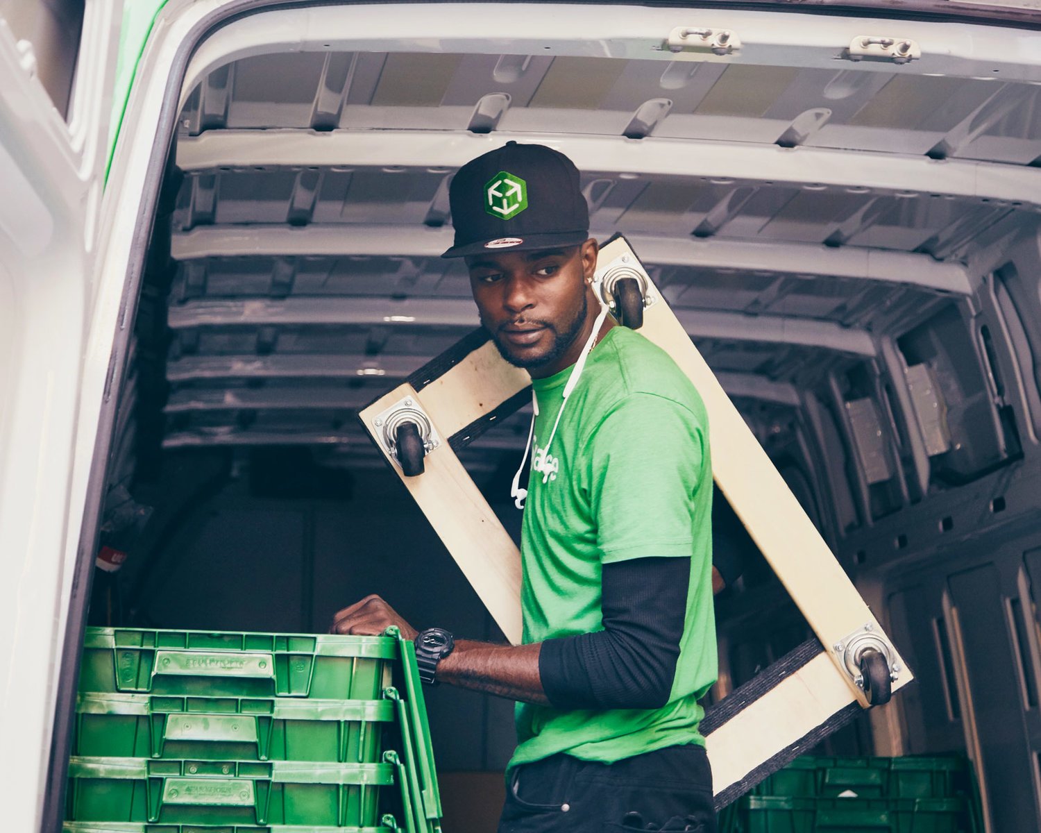
One of our SpaceMakers in the field. Image courtesy of the MakeSpace Blog.
SpaceMakers In The Field
At the beginning of their day SpaceMakers log in to see their full route listed in order, other crew members who are on their route and a variety of tools they use to complete each appointment. Once they click ‘Start Appointment’ the app autogenerates a text to send the the customer to let them know they are on their way.


What does the customer see?
After the crew has started the appointment a text is sent to the customer. When they open the app they can then track the crew. Download the iOS app.


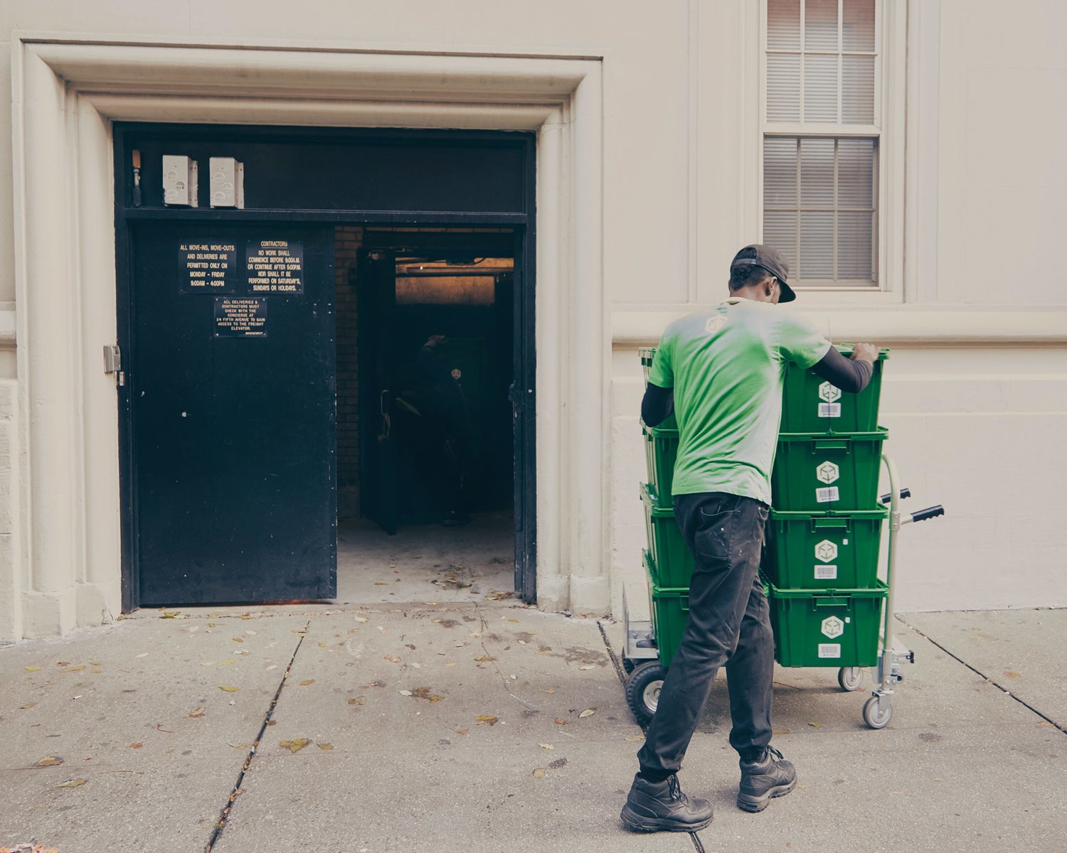
One of our SpaceMakers at an appointment. Image courtesy of the MakeSpace Blog.